


They say if you are not online, you don’t exist.
For retailers this rather interprets to
If you don’t have an e-commerce website, your business is not appealing to a huge number of customers and you are missing out on precious revenue.
Don’t believe us? Take a look at the stats:
- In the last quarter, Walmart’s online sales increased by 97%
- Amazon’s Q2 sales & profit growth was 40%.
- Smaller retailers such as Howards Storage World, B-Wear Sportswear, and Plain Jane among others are seeing double and (even triple!) digit growth in e-commerce revenues, compared to the year before.
- India’s leading e-commerce website, Flipkart witnessed a new user growth of close to 50% right after the lockdown.
What do these 4 companies have in common?
Their e-commerce website designs are spot on, well optimized, and focused towards converting customers.
Clearly, this is the right time to gear up and take your business to the next level.
What things do you need to build an e-commerce website that allures audience?
Whether you plan for a nation-wide retail operation or localized goods selling, the first thing you need is an e-commerce platform to help you build the best e-commerce store.
An e-commerce platform is a software application that lets you set up an online store and manage its marketing, sales, and operations.
There are 3 main types of e-commerce platforms available in the market:
- Open source.
- SaaS.
- Headless commerce.
Each of them provides you with a toolkit for creating an online store:
- Page builder
- Checkout page
- Payment gateway integrations and more.
The difference between those e-commerce platforms lies in the levels of:
- Customization.
- Performance.
- In-built feature set.
SaaS platforms offer out-of-the-box e-commerce store design experience.
Here, you can design a store using a drag-and-drop visual editor within several hours. However, there is limited customization and incapacity to add custom features.
On the other hand, an open source platform is like a blank canvas that, with enough time and effort, you can turn into any sort of e-commerce website. But you are creating everything from scratch. That means you need a coder and a designer on your corner.
Your options
You can choose between headless commerce and Open SaaS platforms such as BigCommerce, SaaS platforms like Shopify (does have a headless commerce offering, but has rigid API call per second limits), SaaS website builders like Squarespace and Wix, and open source platforms like Magento (doesn’t have a native theme editor) and WooCommerce (technically an e-commerce plugin).
Such e-commerce solutions don’t limit your design capabilities so that you can create beautiful and unique websites and you don’t need to build core commerce functionality from the ground up.
At any rate, no matter which store builder you choose to start up with, make sure that your top pick has the following features:
1. Mobile responsive
46% of consumers complete their entire purchase process (from research to purchase) on smartphones.
If your website is not mobile-friendly, you are definitely losing a good chunk of sales. A responsive e-commerce platform ensures that visitors from all sorts of devices have equally great on-site experience – without any design constraints.
2. Customization opportunities
But when it comes to web design, “beauty” usually refers to convenient layout, aesthetically pleasing typography and iconography, crisp visuals, and other on-site design elements that separate your store from others.
If your e-commerce platform lacks customization features and beautiful ready-to-use templates, you are stuck with using the same mold as hundreds of other stores, with little room to show how your brand stands apart.
3. Easy-to-follow site navigation
The term “Navigation” means all the UI elements your users can use to reach specific information on your website.
These include
- Header navigation menu
- Product category pages
- Filters
- On-site search and
- Footer
When your e-commerce platform constrains your ability to create custom navigation paths, you’ll end up with a pretty, but dysfunctional website that few customers will want to use, and your conversion rate will definitely suffer for it.
4. Unique user experience
A good product selling site prompts consumers to complete their purchase, and then shop some more. What ignites that urge and takes brand to the next level?
A well-thought user experience (UX)
In any e-commerce site, UX plays a pivotal role in ensuring that your website is not only functional, but it’s intuitive, reliable, user-friendly, and easy-to-navigate. These factors dial up the interactivity with the site and lead to other good things such as higher conversions, repeat purchases, reviews, and personal recommendations.
So you don’t want to skim on this.
How do you determine if your e-commerce platform is UX-friendly?
Check as many as possible e-commerce website examples and do note what platforms they used. Especially:
- Assess the basic UI components. Browse and explore the website to understand if YOU, as an user, like the navigation, find the layouts effective, and all design elements intuitive and good-looking.
- Scrutinize customization opportunities. The more elements you can tweak, the more unique UX you’ll be able to create as your operations scale. Keep in mind: what looks like an ‘ok to start’ practice for a small store, may turn into a money-draining liability for larger scale operations. Make sure that you can discard and add different design elements as your priorities change.
- Measure the website performance. Page load time and overall website speed can greatly influence your UX. Slow loading pages, glitching design elements, and sluggish product videos often result from a poor CMS/CDN and hosting provider, used by the e-commerce platform.
When creating an e-commerce website, you must incorporate these things
Trust
Imagine heading into a retail store and seeing clothes are everywhere, it’s dirty, no one greets you or makes you feel welcome. What are you going to do next? Probably get out of there as soon as possible.
A huge disaster for the store runner!
When someone visits your store for the first time, they may not know a single bit about your brand, the quality of your products, or your commitment to making customers happy. Deals might earn their consideration, but they’ll need to trust you before they actually spend money.
Customers need to be assured that when they buy from you, they’ll get the exact product as advertised. There are three essential trust indicators that all businesses should include on their website:
Contact information
Nothing throws potential customers off more than a website without contact details.
Include your email and, if possible, a phone number and a mailing address. This type of information, along with an About page, helps potential customers feel they’re buying from a genuine store.
A return policy
A return policy is not only for making people easily bring back products that don’t satisfy them, it actually increases sales by lowering shopping cart abandonment and instilling the customer with a sense of confidence that they can send back an item if they need to, without any transaction fees.
Good visual appeal
Visual appeal is crucial to help customers envision your products online and click ‘Buy’.
Perception is everything when selling your online. People develop their first impression of your site in mere milliseconds. With your Shopify store, making that impression count rests largely on the quality of your images.
Think this way: your product images are like an ambassador, sharing the promise of your product online. Your customer can’t try, taste, feel, or wear your product before they buy, so they’ll rely heavily on your visuals to decide if that product is right for their needs.
It’s better to include product photos with a white background, as well as photos of your products being in use. Take Outdoor Voices’ homepage features for example. Their lifestyle images show its brand side-by-side with more product-centric images to entice visitors to learn more.
Accessibility
Another key factor is your website’s accessibility. You want the colors you select to contrast enough that people of all ages and abilities can see and read your text.
Typography
Lastly, you need to give some thought to typography as customers expect to see dynamic and interesting font styles on websites, not stale and bland fonts like Times New Roman. While the words you write share information, it’s the typography that bears the emotion behind that information.
Thankfully, with a store builder like Shopify, you can access templates with recommended fonts and designs. You can use these fonts on your website or choose fonts from another source to make the necessary customizations you require.
As with colors, it’s a good idea to stick to two fonts and create a hierarchy between them. Managing multiple fonts can be tricky for non-designers, and your website can become a very messy place to look at. Using only two fonts simplifies things.
Select one font type as your header or title font and another to be your body font.
Supergoop does a great job of selecting a title font that reflects its brand while its body font is rather simple, clear, and easy to read.
A unique header font can add some weight to your brand, while the body font will be delivering your actual message – used for all the other copy on your website, from product descriptions to checkout instructions.
While display fonts can have a little more flourish because of their size, it’s essential to pick a body font that’s readable. Know that not every customizable font is designed for screen reading and picking the wrong one (a sleek sans serif, for example) could drive customers away if they can’t read your site.
Design Differences Between B2C and B2B E-commerce Sites
To design a high-performing website, you need to understand who your target audience is and what’s the best way to reach it (obviously a market research is in order).
Both Business-to-Business (B2B) and Business-to-Consumer (B2C) e-commerce websites have the same agenda — make a sale. But the means to reach that goal are somewhat different.
- For B2C companies, brand awareness is the first priority. A recognizable brand with strong online presence translates to a higher share of the total addressable market. Do remember this when choosing your domain name.
- For B2B companies, however, the top priority is lead generation. With a niche market and longer purchase cycles, B2B brands need to keep a steady pipeline of leads that can be converted.
Let’s take a look at what this means design-wise.
1. Customer intent
Although both Business-to-Business and Business-to-Consumer purchases are sparked by a need, the underlying motivations behind those needs are different.
B2B customer intent is driven by business priorities and backed by other people (such as stakeholders, teams, company’s customers, end-users).
With many people to please, the product research time takes longer, and the list of requirements for evaluating products is much more detailed. That’s why B2B e-commerce websites dwell more on converting top-of-the-funnel (TOFU) and middle-of-the-funnel (MOFU) visitors to prospective clients and then turning them into customers using a mix of online (email marketing, eBooks, social media, online demos) and offline sales (phone consultations, in-person demos, etc) strategies.
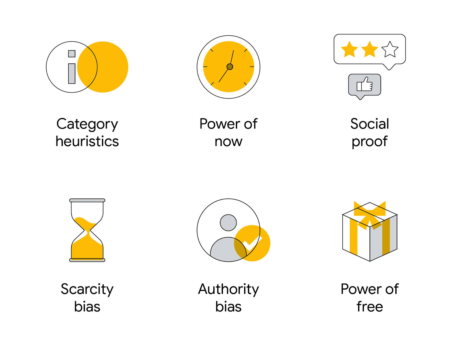
B2C shoppers act on an immediate need. Here, comparing product specs and prices, their average time spent at every stage of the sales life cycle is shorter. Unlike B2B buyers who allocate more time to data-based product evaluation and consideration, a B2C customer often acts on impulse, and thus are more receptive to various cognitive triggers, activated by our bias:
Effective conversion rate optimization tactics, used by B2C e-tailers, leverage these biases in design to sway purchase decisions.
2. Purchase process
In a B2B buying process, more people are involved including both end-users and the purchasing agents/decision-makers. An e-commerce website is a facilitating tool that must inform, support, and demonstrate how your products can meet all of the organization’s needs. And that is done through your content, interactive on-site tools, and supporting marketing assets.
Remember: your main goal with a B2B sell intent is to generate leads, not root for an immediate sale.
In the B2C space, purchase decisions are often more emotional and event-driven.
The coffee machine broke? Buy a new one.
Oh, that shoe looks nice. Let’s look up in google to see where I can buy one.
Most B2C consumers are exploring products constantly and evaluating in-the-background. When they discover a good offer, they are almost ready to buy it.
In that sense, B2C e-commerce websites need to facilitate discovery and fulfill that sense of urgency.
3. User experience
User experience is equally important for both B2B and B2C shoppers. But then again, it has to take the above-mentioned differences into account to address the intent and purchase process. Nielsen group chalks out five important differences in UX requirements for B2B and B2C websites:
- B2B design must accommodate longer content to support long decision-making and sales processes.
- All B2B content has to speak to two target audiences — the “choosers” (decision-makers) and the end-users.
- B2B product information needs to be longer, more comprehensive, and include a clear overview of integrations, capabilities, and regulatory requirements.
- Although both B2B and B2C customers are price-conscious, B2B pricing scenarios are more complex. Provide different pricing ranges variations, pay-per-usage scenarios, or calculators for B2B buyers to facilitate decision-making.
- Just like B2C stores, B2B websites also cater to several customer segments, varying in size, industry, and operational budgets. Thus, B2B websites need to adopt a more diverse, audience-based navigation to cater to all of the targets.
7 Best E-commerce Website Design Examples
Now that you know how e-commerce web design differs for a B2B website, let’s circle back to B2C commerce.
For better understanding, let’s examine these examples!
1. Revelry
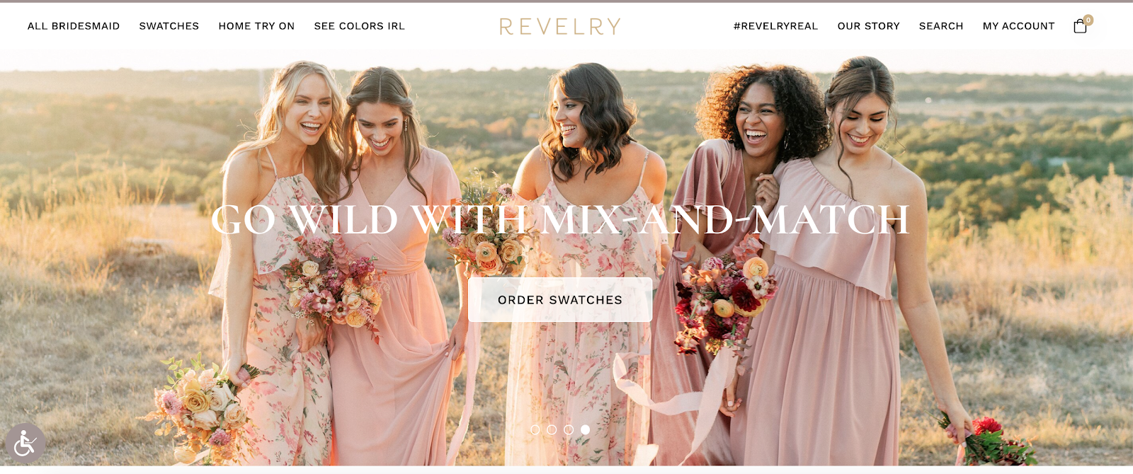
Revelry knows that swatches or sample strips are the shortcut to any bride’s wallet when it comes to the bridesmaids’ dresses, along with free sample delivery and at-home try-ons for the entire party.
Both options have a prominent spot on their e-tailer’s homepage, as well as excellent category navigation, prompting them to discover different dress styles, materials, and colors.
As a result, it creates an effective, efficient way for the customers to make their selection while sitting at home with their friends and family. Given the pandemic situation, this convenience granted Revelry an advantage over others and it is the reason their organic traffic nearly doubled and they garnered nearly $4 million revenue last year.
2. Burrow
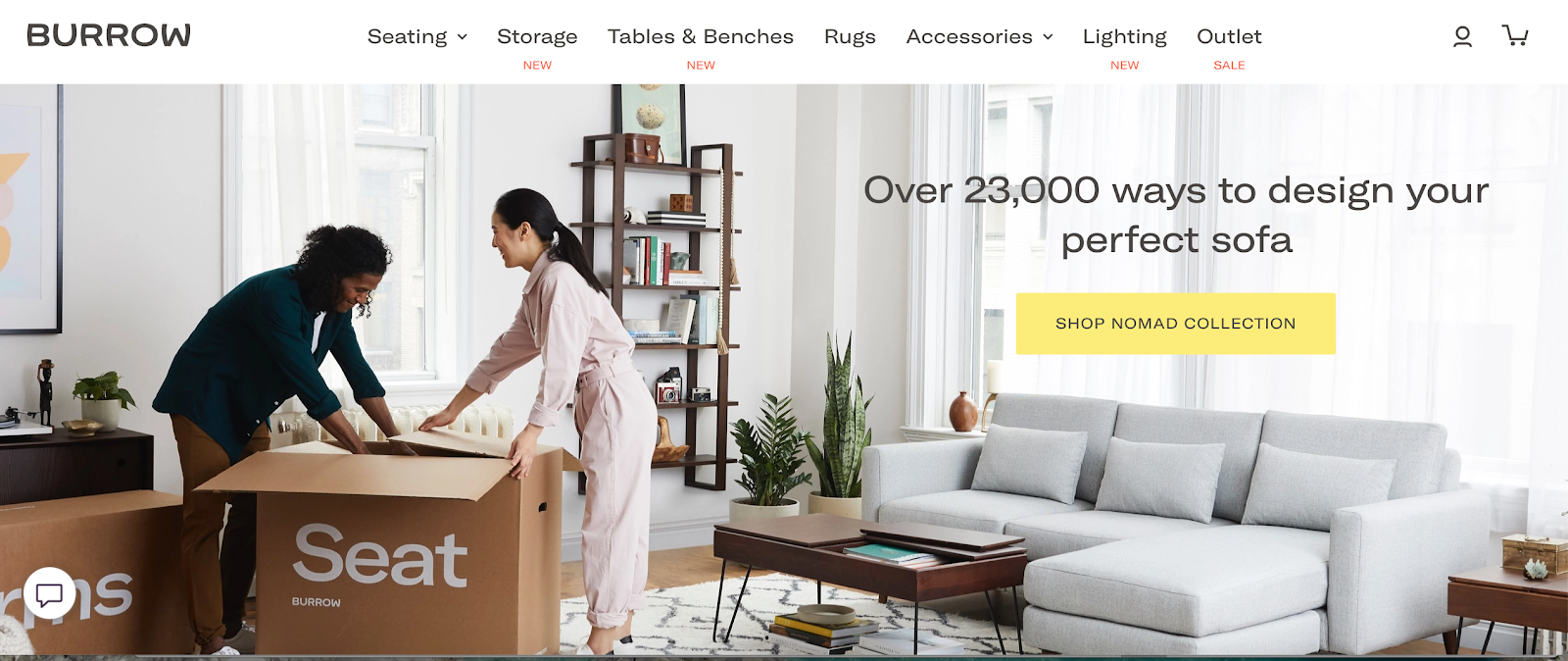
Modular furniture retailer Burrow, favored a home page with video over words to demonstrate their main value proposition — assembling and setting up new furniture can be fun, quick, and tool-less. Using a right mix of product and lifestyle pics, Burrow makes it effortless to imagine their latest designs decorating your home, customize them for the right fit, and order in several clicks.
3. Larq
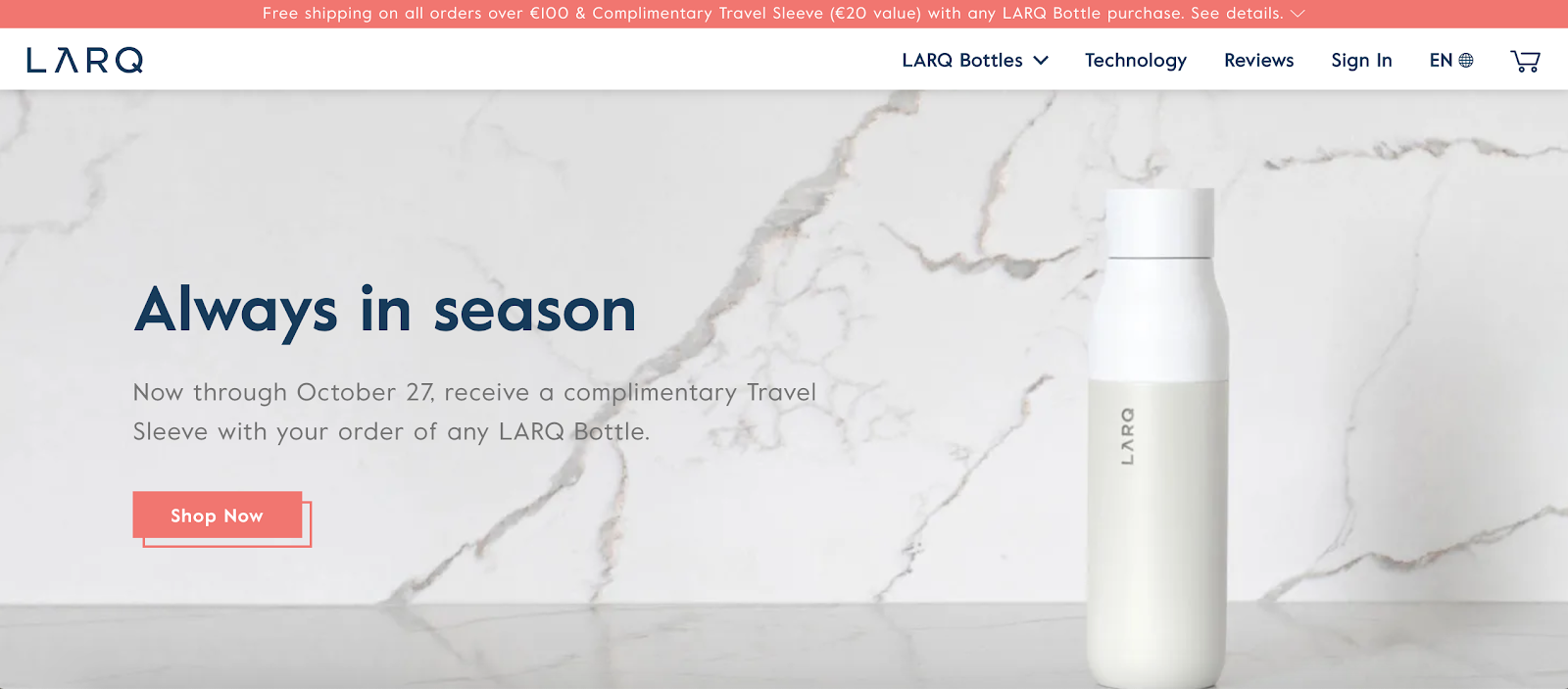
LARQ uses eye-candy product images and animations to get us truly excited about something as simple as drinking water. With spot-on copywriting, color-block product features, and interactive plastic waste calculator, the reusable water bottle retailer encourages us to join their Bottle Movement and explore more of their stylish products.
Adding multi-regional capabilities (using BigCommerce) was another pivotal moment for them. According to LARQ, within 3 months, their conversions increased by 80%.
4. The Mountain
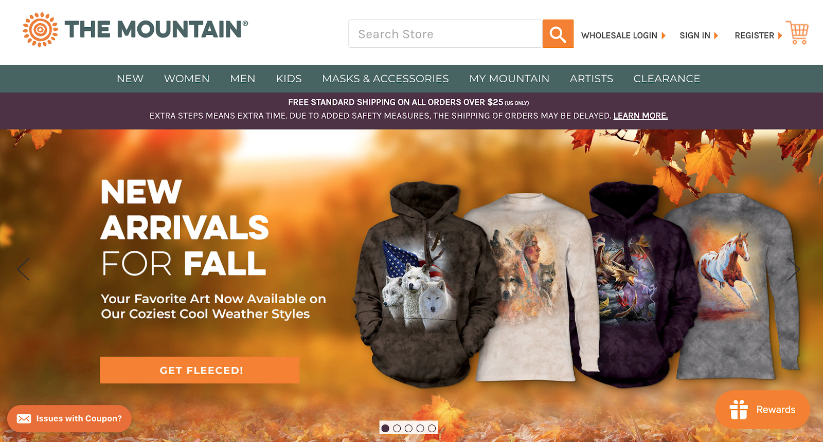
The Mountain has all the great design features that an e-commerce website should have. The straight forward navigation bar, featuring main product categories prompts us to explore more. Service banner, placed under the header, immediately informs about shipping terms and possible delays — indeed a good practice for managing customer expectations.
The hero slider highlights the latest seasonal goodies and promos as well as prompts further discovery. With a wider range of product categories, The Mountain did an excellent design job of organizing everything in categories to reduce the feeling of overwhelm you may experience with a lot of e-commerce platforms.
5. Solo stove
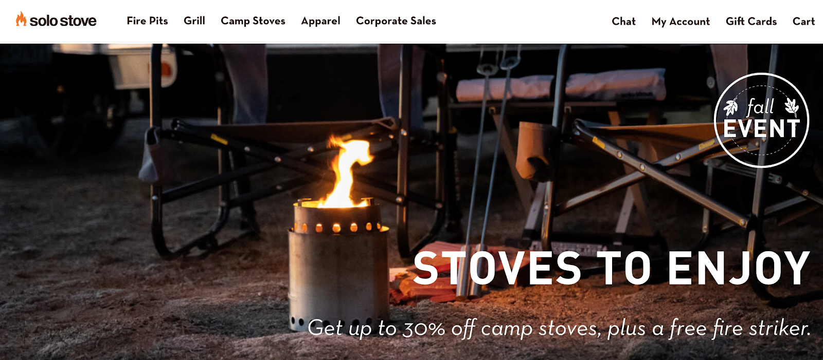
Solo Stove’s website is an admirable example of how to use iconography in e-commerce. This fire pit manufacturer created custom icons for each product category to better convey what they are selling and highlight some of the main product specifications. How-to product videos, illustrations, and FAQ sections help bring across their main features further — their products are durable, easy-to-use, and well worth the price as the reviewers remark.
6. Bliss
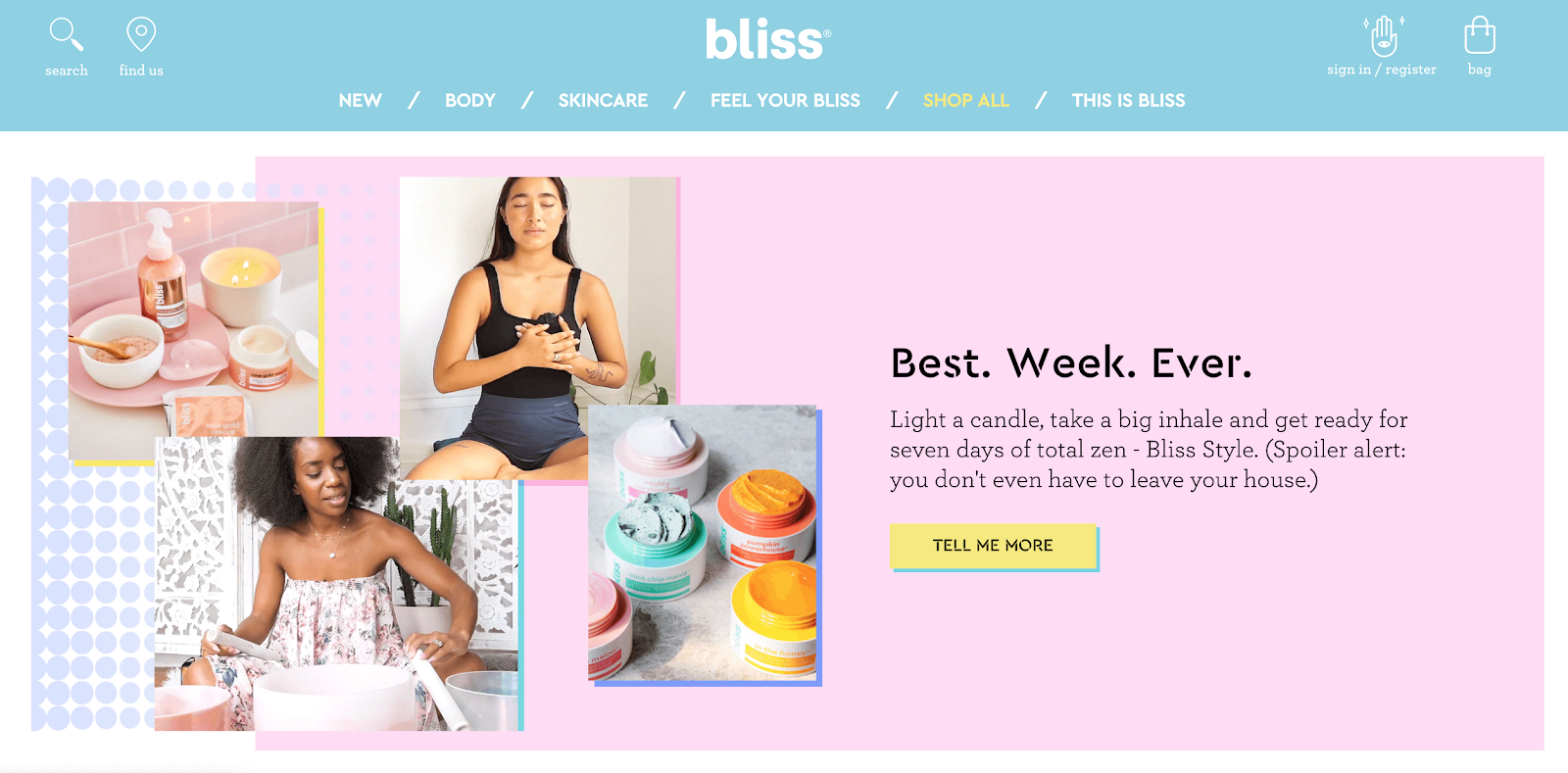
Bliss’ website is an absolute beauty. The spa-powered skincare brand implemented three dominant colors — Millennial pink, baby blue, and Gen Z yellow — in order to visually appeal to their main buyer personas. Their funky and friendly brand attitude is further reinforced through microcopy. The wording of button copy, section titles, and form descriptions makes you feel as if you are talking about your skincare with a friend.
7. Skullcandy
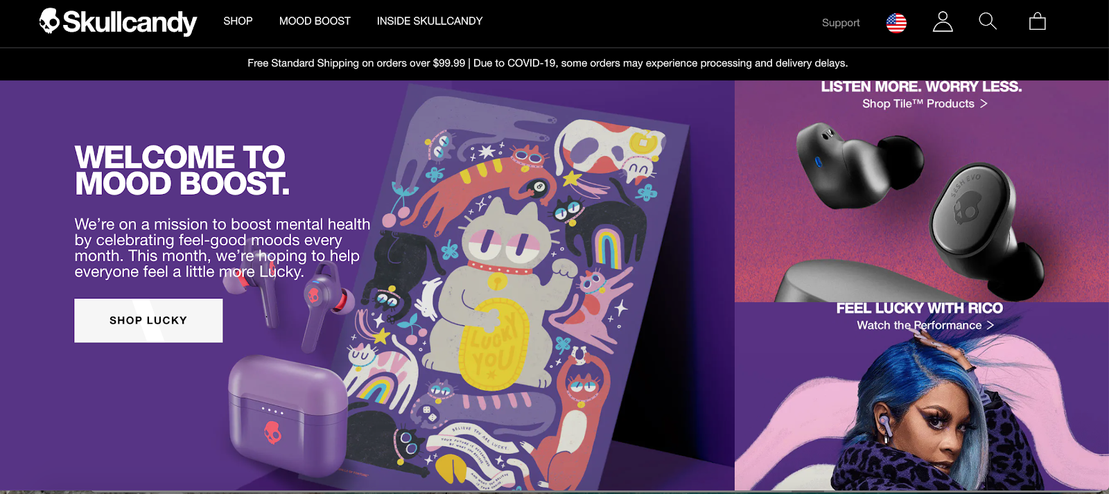
Skullcandy’s website expertly offset bright colors with a signature black website design to create that sleek, lux feeling. They made sure that the products are easy to discover, reviews are in great detail on video, and then you can read on the specs. Though their primary market is audio, browsing Skullcandy’s website is a delightful sensory experience due to their expert use of visuals, material design elements, and video.
Advantages of Using BigCommerce for Designing a Site
No wonder you loved these websites and checked out a few of them as well. One thing common about them is that all of them were designed on BigCommerce. And here’s why many enterprise clients and SMEs choose BigCommerce platform:
1. Design isn’t compromised with other features
Whether it’s a pretty-looking or functional e-commerce website you are looking for – BigCommerce has got you covered.
BigCommerce treats e-commerce website design as house building.
BigCommerce provides you with the technical ‘bricks’ to place at the core of your online operations — no-code page builders, secure check-out, SEO-friendly codebase, and more. You can mix and match different ‘bricks’ to create anything, starting from a tiny house to a 6-bedroom Victorian mansion.
It also gives you flexibility when it comes to the front or interior design of your website. You can give your website a complete custom on-brand look without skimming on SEO, usability, or security. Also, at the same time, you can customize your back-end to match your operations by pairing the in-built core commerce with external integrations.
2. Many (very good) e-commerce themes
You can take a look around their theme store if you need ideas on designs. With more than 150 unique designs, you are bound to find something that suits your needs and aesthetics.
The best part is, every theme is
- Responsive
- Mobile-friendly
- SEO-friendly and
- Optimized for usability.
Using these premade themes can be a shortcut way to designing a great e-commerce website at a lower cost.
3. Customization opportunities
Want to design a truly custom e-commerce experience?
BigCommerce is an open-SaaS platform which means our technical infrastructure can be easily connected with an array of other applications through APIs such as:
- Third-party integrations and add-ons with AR apps
- Custom CDN + CMS to support heavy-duty publishing and
- ML-powered product recommendation engine on top with real-time data
The platform seamlessly integrates with external apps and can be integrated within larger technical ecosystems. Also, with the assistance of their agency partners, like Folio3, that offers BigCommerce design services, you can create a store of your dreams.
With BigCommerce, you can use core commerce features for
- Inventory management
- Payment processing
- Shipping
- Fraud management and more
All of these could be done while using another technology such as WordPress or Adobe Experience Management to power your website’s front end. Such setup is termed headless commerce.
4. Easy-to-use building tools
BigCommerce is way more easy to use than you might think. With the Page Builder — a drag & drop web page editing tool – you can create attractive landing pages whether you are a small business or a Fortune 500 company.
Using these pre-made design elements, you can rapidly create prototype attention-grabbing and click-inducing product listings without writing even a single line of code.
8-Step E-commerce Website Design Checklist
Even with the best-in-class tools, the design process can get easily derailed if you do not have a clear roadmap. Here is a design checklist to make sure nothing misses your attention.
- Homepage
- Category pages
- Product landing pages
- Checkout page
- About us
- Search bar and search results page
- Account registration and login forms
- Email subscription form
Let’s look at their importance one by one.
1. Homepage
A homepage is the first interaction point between you and a potential customer. Think of it as a digital storefront for your online business. With roughly 3 seconds to make a good impression, you need to be strategic with your homepage design.
A high-performing e-commerce homepage should embody following elements:
- Clear set of product categories – either in the header or sidebar section
- Hero image or image slider featuring the main product or current offers
- Curated presentation of recommended products, trending items, or product categories.
- Enter and exit pop-up or sticky offers for retention.
The structure above is not set in stone, though. The appearance of your homepage will be determined by two factors — your industry and your customers’ preferences.
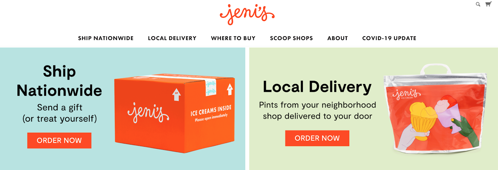
For example, Jeni’s ice cream immediately prompts the shoppers to decide whether they want to order a takeaway from their local store or ship nationwide.
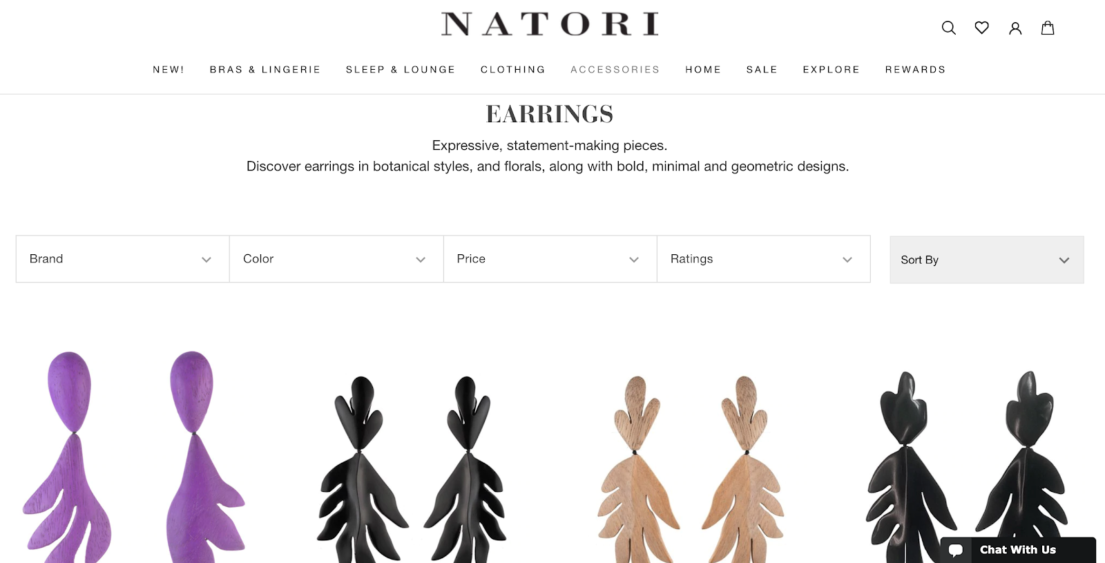
2. Category page
Category pages help keep all your products organized and facilitate easier discovery. With so many digital distractions, customers want instant information, especially when they are on mobile devices. So you need to serve them with quick access to the products they crave.
Apart from user experience, category pages also need to be optimized for SEO (search engine optimization). Incorrect parent-child relationships, can result in duplicate content and hurt your rankings in search results. Thus ensure that each of the category pages:
- Have a descriptive, SEO-friendly URL
- Features unique texts for category descriptions
- Fits logically into your overall information architecture
- Features additional filters for sorting product suggestions
Natori follows all of these principles to create a pleasing browsing experience for buyers:
3. Product page
Product page design is exceptionally important for any e-commerce website. Whether you sell smartphones or sunglasses, if your listings look not-so-attractive, your traffic and conversion numbers are bound to stall. At the very least, your product page needs to feature:
- High quality product photo(s)
- Product specs, such as: name, color, sizes, prices, key features
- ‘Buy’ and ‘save for later’ buttons
- Detailed product description
- Social proof/customer reviews
- Related products (upsells and cross-sells)
Then you can spice it up with some extra features — a countdown timer, video or AR demos, check-in-store option, back-in-stoke alerts, and more!
4. Checkout page
Many factors can prompt the customer to abandon their shopping cart, according to Baymard Institute:
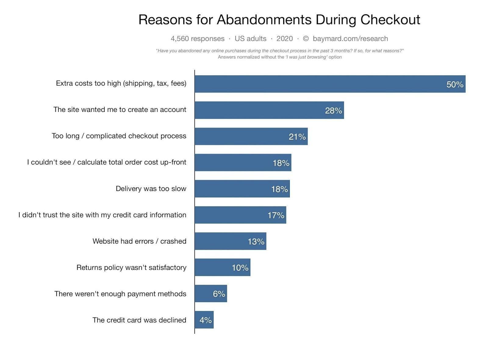
Most of these can be prevented by improving your checkout page look and flow.
- Enable a ‘guest checkout’ for the first-time shoppers and prompt them to register an account with you after they’ve completed their purchase.
- Reduce the number of required form fields. On average, e-commerce websites have 12.8 fields in the checkout flow. However, you can capture all the customer data you need within 6-to-8 fields.
- Clearly list all of the payment methods you are accepting (debit or credit card, Apple Pay, PayPal etc.).
- Inform about all the possible costs before checkout. You can place a sticky banner informing visitors about the ‘free shipping’ threshold. Incorporate handling fees in the product pricing. Make sure to automatically apply relevant sales taxes pre-checkout.
5. About Us Page
Don’t treat the“About” page as an afterthought, especially if you’re in B2B e-commerce. Because 52% of business buyers say that one of the first things they want to see on the vendor website is the “About Us” page.
There are many ways to craft an attractive “About Us” page for an e-commerce company:
- Tell a story about your products
- Introduce your team (that would give it a more personal touch)
- Boast your company values and ethics
- Explain how you operate
- Talk about your history
- Or present your future vision
Design-wise, keep the texts short and to the point. Avoid sales pitches and CTAs, but do use good team and product visuals to back up your story.
6. Search Results Page
Larger e-commerce stores need to think well and lay good research work about the on-site search experience.
To create a great on-site search experience:
- Make the search bar easy to discover
- Auto-completes come greatly handy
- Provide results for misspelled words
- Personalize search results using analytics
- Support image searches along with text queries
7. Account Registration & Login Forms
Don’t make the login form too busy looking. It should be short, progressive, and friction-less. Ask the shopper to provide the basic information first (email/pass) or even log in with one of their social accounts (as can be seen with many login forms today).
Every extra step during registration increases the chances of the customer losing his/her interest. Request shipping and billing details after the registration is complete. Offer users an option to save and re-use their details in an address book — this is for everyone’s convenience.
8. Email Newsletter Form
A well-executed e-commerce email marketing campaign can drive repeat traffic and maximize conversions. However, before you go on to email marketing, build your email list and choose a suitable email marketing platform first.
To entice subscriptions, give your newsletter a prominent placement at the homepage and keep a sticky or pop-up version in the footer area as well. To retain first-time shoppers, you can also use a small discount pitch for a subscription.
10 Experts Advice on E-commerce Website Design
We’ve talked and shown you how a winning e-commerce design should look like and what pages it needs.
Now let’s have a look at design tips from experts.
1. Keep it simple
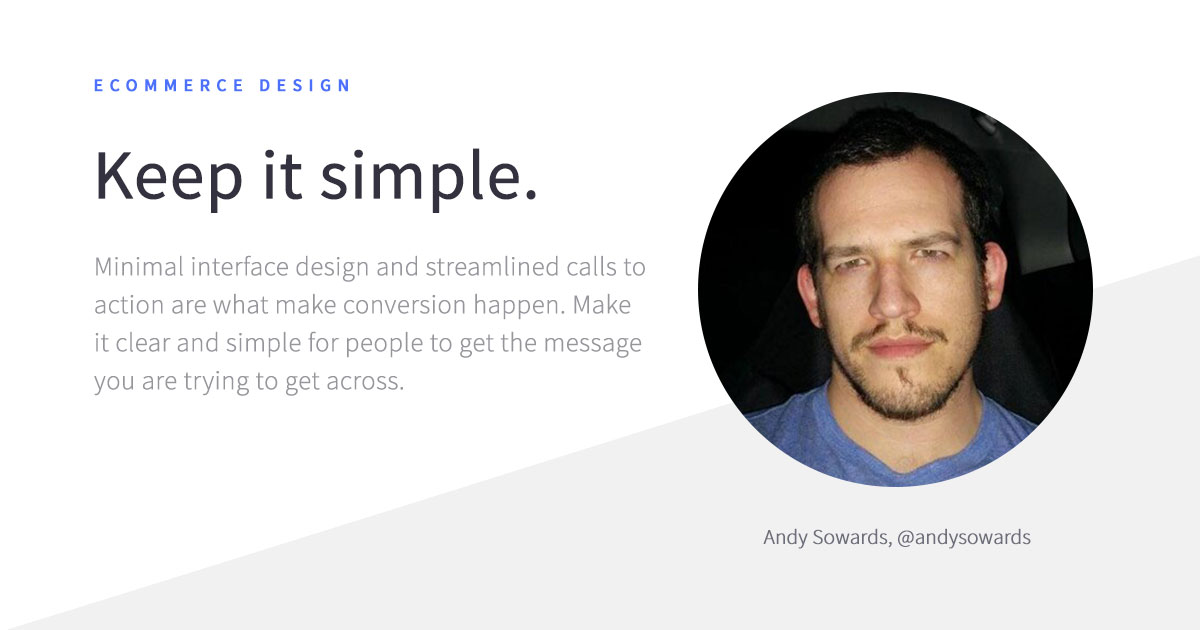
The path to purchase has to become immediately obvious to the customer. Before you add a new design element to the page, ask yourself this:
Will this help or impinge the buyer journey?
It’s best to begin with a minimal landing page. Then add extra conversion-making elements as you learn more about your audience behaviors and their preferences.
2. Conversion is about satisfaction
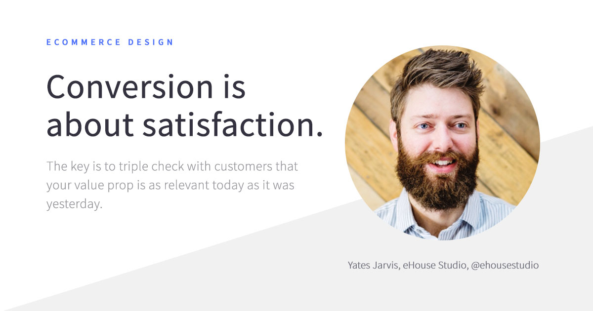
Ensuring great user experience amplifies the pleasure of interacting with your brand. On the other hand, design flaws chip away that feel-good feeling.
After you are done with the initial design, make sure to audit each page. Determine where you can remove friction and add extra delight to further improve your conversion rates.
3. A custom store protects you from competitors
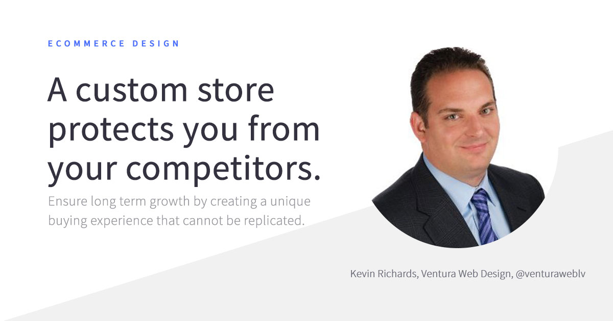
Branding is a truly powerful asset for building emotional connections with your audience and turning them into your vocal brand advocates. Studies show that Four out of five customers are more willing to promote a long-time favorite brand. By crafting a distinctive e-commerce shopping experience, you are securing your spot as a long-time favorite brand – one interaction at a time.
4. A great user experience should always come first
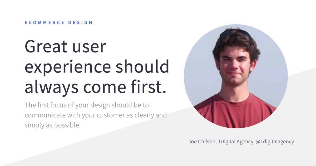
Lucrative prices, cool promos, catchy banners are still important, but their effectiveness shrinks if the overall UX is outdated. You need to focus on ensuring high website usability and performance first. Then, work on extra graphic design elements to level up your game.
5. Embrace flat design
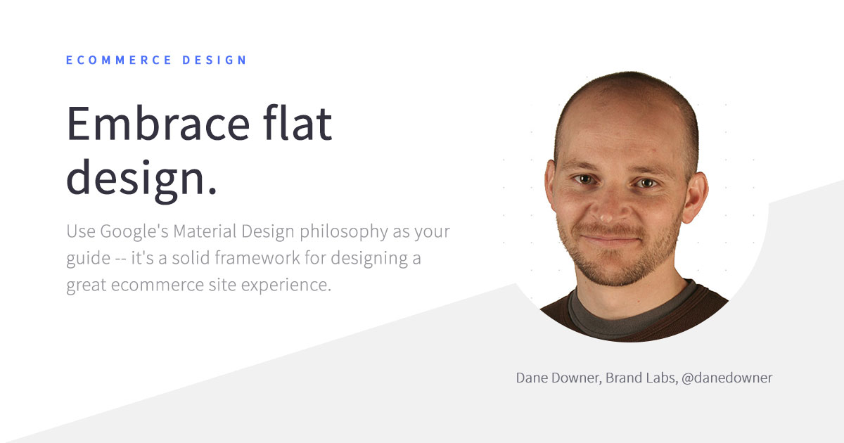
By now flat designs have become a ‘classic’ look around the web. And for good reason.
The main principles of flat design prompt:
- Clear hierarchy to speed up information processing.
- Action-emphasizing iconography and adaptive design.
- Usage of familiar patterns that helps us quickly understand affordances.
All of these elements add up to a great e-commerce experience for a user.
6. Be distinct
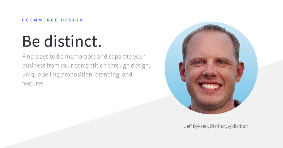
The e-commerce space is getting busier each year. Your branding, iconography, website features, and on-site experience should together reinforce your unique value proposition and differentiate your e-commerce business from the competition.
7. Think CRO when designing a website
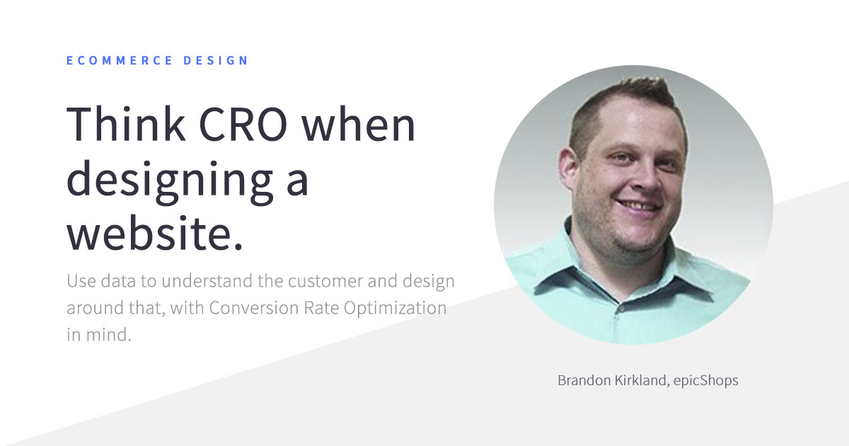
Back your design hunches according to data. Study your customer lifecycle, analyze their browsing habits if you are redesigning or especially conduct usability tests with a focus group. Learn as much as you can about their browsing habits, then incorporate those findings into your design. Your website’s design should not just be aesthetically pleasing to you but also appeal to your target audience.
8. Show, don’t tell
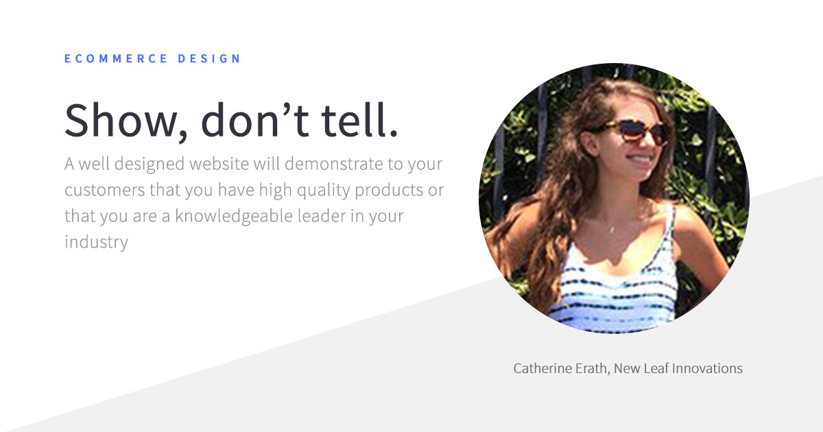
A great e-commerce website visually leads the customer during their journey. Each and every element plays a strategic role in that discovery process.
Tooltips and service texts can be hugely helpful and prompt conversions. But if you need to explain each new step, the selected design isn’t playing well for your brand.
9. Don’t make your customers think
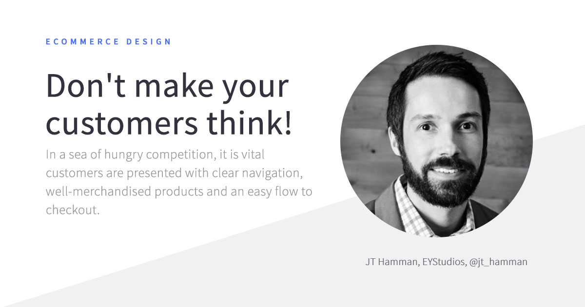
Online product discovery and purchases should be intuitive. Present a clear path to purchase for each visitor through navigation bars, straightforward information architecture, and promptly-placed call-to-actions. By minimizing the cognitive load at each step towards a purchase, you are increasing the chances of conversion.
10. Seek first-hand customer data and feedback
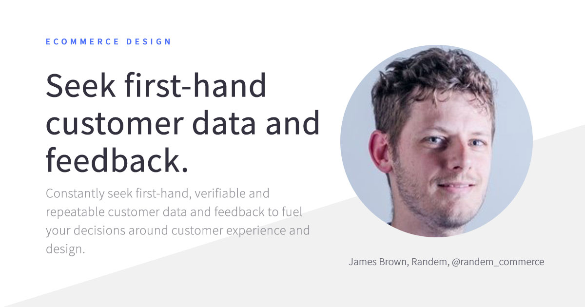
With a ton of e-commerce advice and best practices around the web, it may feel tempting to use each one of them.
But more isn’t the merrier.
Not every practice works out universally well for every retailer. As a business owner, make your design decisions on the basis of first-hand customer data and feedback, rather than common wisdom. This way you’ll create a unique user experience that leaves a mark in your target audience’s mind and makes them more loyal to your brand.
E-commerce Website Design FAQs
Still got some pressing e-commerce design questions left? Let’s sort those out.
What is e-commerce website design?
E-commerce website design is the process of creating an online store for your business to sell the products digitally to target consumers. In order to design an e-commerce website, you need to plan, conceptualize, and arrange your content and products for effective display and visibility on the internet.
What makes a good e-commerce website design?
What makes a good e-commerce website design?
A good e-commerce website design has 4 key elements
- Clear navigation
- Effective information architecture
- Optimized product landing pages
- Easy checkout.
All of these combined sum up to great usability.
How do you build an e-commerce website?
Here are the steps you need to follow to build an e-commerce website, even if you don’t know how to code.
- Research and decide on your niche
- Identify the products and product types you want to sell
- Develop your business model
- Find an e-commerce platform or e-commerce website builder
- Choose your business name and register a domain for that name
- Set up payment methods
- Test out and publish your e-commerce store
What are the most-wanted e-commerce website design features?
The most-wanted e-commerce website design features are the ones targeted at improving conversion rates. These include
- User-generated reviews
- Wish lists
- High-quality photos
- Demo videos
- Product recommendations
- Find-in-store search option
- One-click checkout
- Multiple payment options support and
- A mobile-friendly design, featuring all of the above
Do small e-commerce stores need specific design elements?
Small e-commerce stores should prioritize user experience in the same way as big e-tailers. This means ensuring responsive, mobile-friendly designs and convenient filtering and navigation. Incorporate high-quality visuals, too, and don’t forget to support different payment methods.
Do large e-commerce stores need specific design elements?
For a large e-commerce store, effective navigation is key. Spend more time on determining the right information architecture for showcasing your stock. Have different product category groups and sub-groups to speed up discovery.
Also, keep a powerful on-site product search that also supports different filtering options like, by price, product type, size, color, season, etc. Your design should naturally fit discovery, not ramp up the feeling of overwhelm due to the sheer volume of choice.
What are current e-commerce website design trends?
The ongoing e-commerce website design trend right now is personalization as that’s what most e-commerce shoppers expect by default.
Personalized user experience can be achieved with
- Dynamic landing pages
- Data-based product recommendations
- Upsells and cross-sells
- Product quizzes and
- Curated edits.
Are most e-commerce themes free?
Actually, NO. Most good e-commerce themes come at a price. But they are well worth the investment. Premium e-commerce themes (unlike free ones) are tested to be bug-free, SEO-optimized, and fully secure.
Support and troubleshooting also come as a bonus with most paid e-commerce website themes.
What do I need to do if I want to create a custom website?
Building a fully custom e-commerce website, instead of using an e-commerce platform will surely cost more. However, if your goal is to achieve a fully custom look for less and faster, you can go with a headless approach to e-commerce development.
Which e-commerce website builders should I use to design a store?
BigCommerce is overall the best to opt for. However, other e-commerce platforms like Shopify, WooCommerce, Wix also offer many advantages. Make sure the platform provides all the essential e-commerce website design features you need to craft an e-store of any size.
Smaller retailers often prefer core commerce features and visual design tools within an affordable price. Enterprise clients put more emphasis on open SaaS platforms as it places no limits on design or integrations with other apps. This also focuses on managing your operations without worrying about backend development and maintenance.
Are B2B e-commerce stores designed similarly to B2C e-commerce stores?
B2B e-commerce stores use the same UX design patterns as B2C e-commerce stores but have a somewhat different structure and selling strategies. Since the sales cycle is longer in B2B, such stores focus more on capturing TOFU and MOFU prospects (as discussed earlier) rather than enticing an immediate conversion as B2C stores. That’s why some of the key design elements for a B2B e-commerce store are:
- Longer product landing pages
- Featuring demo videos
- Comprehensive product descriptions
- CTA forms offering to request a product demo
- Schedule a call
- Longer check out forms
- Asking to provide minimum order quantity
- Offering payment plans and pricing calculators for large-volume orders
Wrapping Up
Finally, good e-commerce website design is all about iteration. Start with the essential pages and design some quick prototypes.
Test each of them with your team to make alliterations. As you launch a new look, collect first-hand insights from your customers.
Between conversion optimization, new product landing pages, and seasonal promotions, you will always have plenty of ‘design’ work to do. But with functional and performance requirements taken care of by your e-commerce platform provider, you can focus on the creative part of the process.
Now, just outperform yourself with every new design variation!
E-commerce websites have changed the way consumers shop online and have transformed the way businesses sell and market their products.
If you are a larger corporation looking to develop a custom, well-branded e-commerce website, PineGrip offers the staff and solutions to help you achieve your goals on a large scale.
Table of Contents
- What things do you need to build an e-commerce website that allures audience?
- When creating an e-commerce website, you must incorporate these things
- Design Differences Between B2C and B2B E-commerce Sites
- 7 Best E-commerce Website Design Examples
- Advantages of Using BigCommerce for Designing a Site
- 8-Step E-commerce Website Design Checklist
- 10 Experts Advice on E-commerce Website Design
- E-commerce Website Design FAQs
- Wrapping Up